
When you’re creating a website, good design principles suggest that you should make it as easy and clear as possible for customers to use. Unless, of course, your website is intended to be confusing. These web pages have been nicknamed “dark patterns” by user experience designer Harry Brignull, and are distinguished by deliberate anti-usability features designed to help con customers out of their hard-earned money. But it’s not just scam sites that use these features — everyone from Amazon to Facebook has been getting in on the dark patterns act, sneaking items into your basket without you asking for them or slipping hidden costs onto your bill without so much as a warning. We look at ten devious, underhanded and downright unscrupulous perversions of good web design that big companies are using at the moment.
10. Sneaking Items Into Your Basket
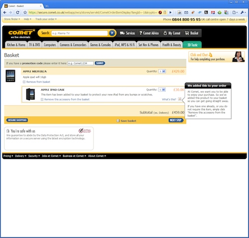
This has to be one of the most annoying tricks companies use: automatically adding items to your shopping list that you did not select, sometimes without even a warning that they have done it. This is justified as a way of being “helpful”: if you’re going to buy an iPad, surely you need a case to keep it in as well, right? Yes, except that the optional extra features which the shop adds to your bill are often designed to be easy to miss by the consumer; because people scan-read on the Internet, many will just click through the checkout page without realizing that they are paying more. In other words, it’s an up-sell device designed to punish the user for their lack of attention. What a charming business model.
9. Tricky Questions
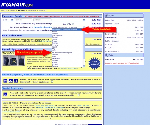
This is a clever design trick that takes advantage of the fact that nobody likes to spend ten minutes staring at a page just to work out what it means. Basically, trick questions are deliberately set up so that it’s hard to tell which option to select to avoid paying. For example, Irish budget airline Ryanair’s passenger details page has a box near the top with the words “please select country of residence.” Many customers will fill this in automatically without realizing that this option buys travel insurance, which is included by default: the option not to buy this service is only shown halfway down the list. This is another example of companies using “anti-scan” devices that penalize customers for looking for words and patterns that they recognize and not paying enough attention to what they actually mean.
8. Making it Confusing to Make Your Details Private
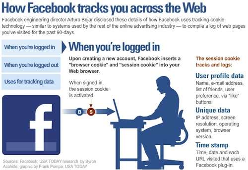
Many people are concerned about their privacy on social networking sites, and in many cases they are right to feel this way. For example, Facebook’s default settings mean that users will be sharing valuable information such as the groups they join and their “likes” with advertisers. Opting out of sharing these details is a lengthy process that involves clicking through multiple screens and going to multiple areas of one’s account. Facebook’s default settings also allow everyone on the internet to view users’ profile information, which means that those hilarious photos of drunken college nights out are visible to any potential employer who cares to look at them. And we thought The Social Network painted Mark Zuckerberg in an unflattering light! Seems we didn’t know the half of it.
7. Hidden Costs
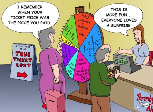
Know how budget airlines can afford to sell flights for $20? Hidden charges, that’s how! This is a very common dark pattern with companies that sell tickets or low budget services and goods. Sites like Ticketmaster have been known to charge as much as half the price of the original service in “extras” such as booking fees, service charges and “convenience charges.” Since these services are often a mandatory part of the goods the company sells, there’s no reason why these charges couldn’t be stated up front — other than a strong desire not to let customers know the real price of what they are buying, that is.
6. No Way to Unsubscribe
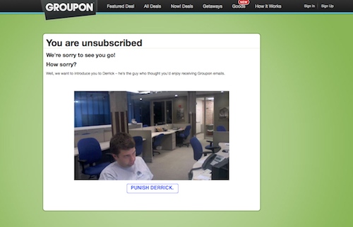
When you sign up for a service on a website, they often use simple one-click methods that allow you to subscribe very quickly and easily. Unsubscribing, on the other hand, is usually a lengthy process, by design, which involves e-mailing, phoning or sending snail mail to a central office. For example, Barnes and Noble make it damn near impossible to unsubscribe from their newsletter. Money Supermarket, meanwhile, cunningly hide their “opt out” with some misleading information (see below). Even the companies that provide an easier unsubscribe option commonly include surveys and other methods to guilt-trip consumers into not wriggling out of their clutches. This is also known as the “Roach Motel” method, because once you check in it becomes very hard to check out.
5. Misdirecting the User
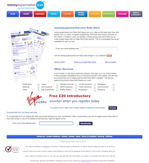
This method works by hiding important information from the user, either by diverting their attention to something else or by simply placing it somewhere inconvenient where it won’t be immediately obvious. In the Money Supermarket example shown above, attempting to unsubscribe actually brings you back to the subscription page for the website! The option to discontinue their services is hidden right at the bottom of the page, in an area only seen by scrolling down. As a marketing trick, that’s pretty “low”…
4. Deliberately Poor Price Comparison
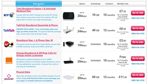
Many firms make it very difficult to compare prices properly on their websites — some by accident and some by design. Some businesses, like insurer Direct Line, refuse to allow their sites to be listed on consumer ratings and feedback websites since they want to avoid unfavorable comparisons. Pizza restaurant Papa John’s takes this a step further: their iPhone app allows you to order online, but the menu fails to inform you about the items on special offer, so it’s perfectly possible to end up spending almost double the amount you should be paying for a pizza. This strategy nullifies the Internet’s capacity for sharing information in favor of confusing the customer into paying more. Not exactly the most ethical use of web design.
3. Automatic Renewals
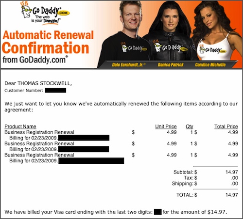
This is another trick companies use to sneak in extra costs over their customers’ heads. When a gullible consumer signs up with a low-cost domain registration site like Godaddy, which allows you to register domain names and businesses online, they expect to get what they signed up for. In fact, the process includes an extra charge (business registration renewal). In order to get rid of it, the user must uncheck a box in the original agreement. Beyond this, the registration is renewed automatically and the customer is only informed of this after the fact. The automatic renewals are often buried in layers of confusion and red tape in the initial customer agreements with the website. To add another layer of annoyance, most of them have to be cancelled by phone, e-mail or snail mail rather than by an online unsubscribe. Talk about maximizing inconvenience…
2. Disclosing Personal Information
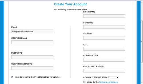
These days, whenever you create an account for a website, you generally have to divulge all sorts of personal information like your address, name, zip code and email addresses. What does the company do with your details? Well, often it sells them to other companies. For example, Verizon Wireless phone users are required to give information such as email addresses, home addresses and zip codes in order to register for the cellular service. Under the company’s privacy policy, this information can be sold for a healthy profit to advertisers, who can then target customized text messages at users. The next time you’re signing up for a service, be aware of just how much valuable information you are potentially giving away.
1. Ad Traps

If there’s one thing that’s universally annoying about surfing the internet, it’s those gaudy, animated, bad taste banner ads that seem to appear on almost every website. But, did you know that some of these are not only designed to catch your attention, but also to make you lose money? Some of the worst offenders among them: “Scareware.” These are so-called virus scanning programs like McAfee, which often activate when you enter a website and tell you that you have active threats on your computer. Naturally, the only way to clear these is to download software from the company’s website, often at a considerable price. Even more annoying are the ads that claim that the customer has won an expensive free gift (like an iPod or X-Box 360). In order to redeem it, they are required to sign up for multiple online services and give out personal details. The worst part is that there is often no real prize to be redeemed, after all. Also, anyone remember that irritating “punch the monkey” ad a few years ago…?
 Follow
